Making inline scrollable bar charts in Google Sheets

Recently, I wanted to make a bar chart in Google Sheets from a dataset with hundreds of rows. When I used the built-in Chart functionality, it wasn't able to fit all of the bar labels on screen at once. I made the chart its own sheet (so it'd be as big as possible) and set the labels to use the smallest possible font, but it was still only showing half the labels. I needed to see all the labels, so this was no good.
What I really wanted was a bar chart with a scrollbar, but Google Sheets doesn't have an option for that... However, even though charts have a small finite length, your data table does not; you can have as many rows as you want. Google renders the spreadsheets with scrollbars, which got me thinking – can I find a way to create a bar chart just using text?
Unicode block characters #
For the most part, data cells can only hold text, but that still gives us a lot of options. As of this writing, the Unicode character set (the system with which most text is encoded these days) includes 143,696 characters. Of particular interest to us is the Block Elements character block, which includes these symbols:
█Full block (U+2588)▉Left seven eighths block (U+2589)▊Left three quarters block (U+258A)▋Left five eighths block (U+258B)▌Left half block (U+258C)▍Left three eighths block (U+258D)▎Left one quarter block (U+258E)▏Left one eighth block (U+258F)
These 8 symbols are specifically designed for drawing bars. They all have precise, consistent widths, and they don't have any whitespace around them (so if we put several of them together, they'll form a solid bar). Now we just need a formula to use these in Google Sheets.
The formula #
Here is the formula I came up with (assuming your number value is in cell A2):
=REPT("█",A2/8)&SWITCH(FLOOR(MOD(A2,8)),0,"",1,"▏",2,"▎",3,"▍",4,"▌",5,"▋",6,"▊",7,"▉")
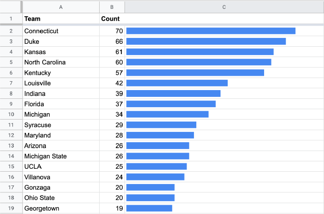
Set the font to Calibri (more on fonts later) and set the text to be left-aligned (if it isn't already). Once you do that, you should get something like this:

Now you've got a chart with bars that are one-eighth as wide as your number value (e.g. if your value in A2 is 36, it'll draw a bar that's 4.5 blocks wide). However, we have plenty of options for further customizations.
Colors and formatting #
Because the bars are made of normal text characters, you can format them the same way you format normal text. To change the bar color, simply change the text color. To change the background color, change the text's background color. You can even use conditional formatting for fancy color-coding.
You can also adjust the font size to make the bars bigger/smaller, or turn on italics if you want slanted bars for some reason. Bold/underline/strikethrough are generally not useful.
Scale #
If you're dealing with really big or really small numbers, you'll need to adjust scale of the the bars. You can do this by multiplying/dividing A2 by a scaling factor.
Here's a version that's 10 times wider (1 block = 0.8 units):
=REPT("█",(A2*10)/8)&SWITCH(FLOOR(MOD(A2*10,8)),0,"",1,"▏",2,"▎",3,"▍",4,"▌",5,"▋",6,"▊",7,"▉")
And here's a version that's ten times narrower (1 block = 80 units):
=REPT("█",(A2/10)/8)&SWITCH(FLOOR(MOD(A2/10,8)),0,"",1,"▏",2,"▎",3,"▍",4,"▌",5,"▋",6,"▊",7,"▉")
Replace the 10 in those formulas with whatever multiplication factor suits your needs.
Advanced customization #
A few more things to experiment with, if you're the tinkering type...
Fonts #
Most of the fonts in Google Sheets don't support Unicode's Block Elements. Some support the 'full block' character, but don't support any of the partial blocks, which causes the bars to look really janky (because they're using two different fonts). I had you set the font to Calibri because Calibri doesn't support any block characters, so all the characters use Google's fallback font.
However, there are a few fonts available in Google Sheets that do support all the block characters and can be used to tweak the appearance. The only two I've managed to find are Source Code Pro and Fira Mono (or Fira Code). Both of these make the blocks much narrower, and the Fira fonts also make the blocks very tall. You can find these fonts by clicking the "More fonts" button in the font menu and searching for them.
Vertical bars #
If you want to make a vertical bar chart, the easiest way is likely to simply use Google Sheets' text rotation options with the above formula. However, Unicode's Block Elements also includes lower partial blocks just like the left-aligned ones, so you could adapt the formula to use those.
Gridlines #
If you want gridlines every 8 units, you could simply add a space after each full block (i.e. in the formula, change "█" to "█ "). To make the gridlines thinner, you might try using a thin space ("█ ") or a hair space ("█ ") (see this page for more info).
However, there is no easy way to add gridlines at any interval besides 8 (or multiples of 8). I attempted to make a formula that could support gridlines at any interval by making the bars stretch across multiple columns, but I couldn't find a way to make it not-ugly and gave up.
Right-aligned bars #
Currently, it isn't possible to make the bars look correct while right-aligned, because the block characters are all left-aligned. Even with the right-to-left marker, there's no way to make them line up nicely on the right edge.
However, this may change in the very near future! Released just last month, Unicode 13.0 added the Symbols for Legacy Computing block, which includes right-aligned versions of all the block characters we're using. Only a few fonts have implemented it so far, and none of them are in Google Fonts yet. Hopefully that changes within the next few months.